LoS Branding & Website
background
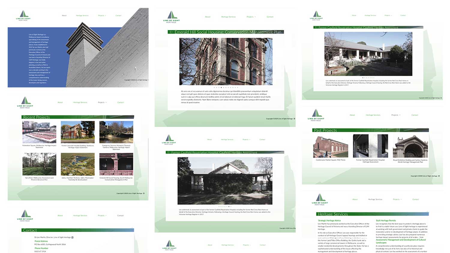
Line of Sight Heritage is a Melbourne-based consultancy specialising in the assessment and management of heritage places. They approached me wanting a new brand identity and simple website showcasing their latest work and business information.

The work
The term ‘line of sight’ means what you can see from ground level when looking up from street level. LoS wanted to represent this notion while promoting the landscape side of the business. From the beginning we discussed using earthly colours while also keeping a structural look to the logo.
Stylistically the website needed to reflect the area of expertise with out being confused for an architectural firm or too immersed in old buildings as the business had broader reach.

The result
The brand identity conveyed both structure and landscape which worked well in both colour and B&W. These where printed on a range of stationery.
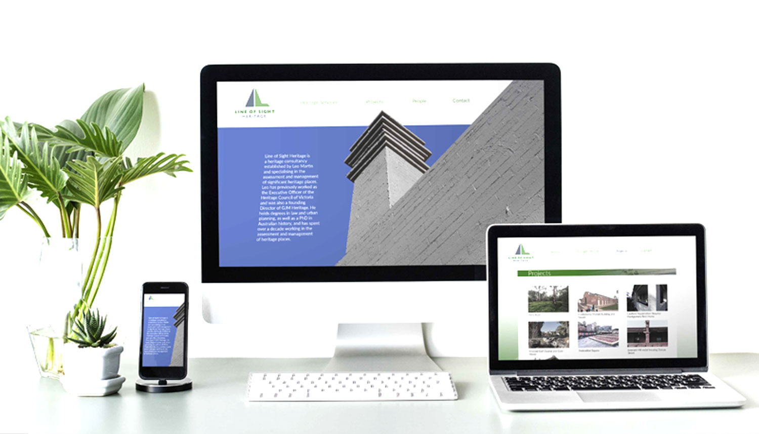
The website required visual content so a day of photography was needed to capture past and current heritage projects. The result was a modern clean design with a hero image that complemented the angular design of the logo. The colours and structural elements resonate throughout the site maintaining the branding on every page.


