
The case study
What if you were sick, bed ridden and in need of medication?
For my two week sprint class assignment at General Assembly I teamed up with fellow user experience design students Michelle and Phillip to research implementing a fast local delivery service onto the Chemist Warehouse website which would be perfect for anyone bedridden with the flu. This service was similar to other fast delivery services such as Uber eats and Menu log.
Discussion guide
Informed by our business analysis we agreed on a series of questions to ask customers, these questions were designed to gain insight into the customer experience within the store, on the website and any other experience they had using online delivery services.
inquiries & interviews
We visited a busy Chemist Warehouse store to observe the shop layout and how customers interacted with it. The store we visited in the Melbourne CBD was crowded with many people asking staff for help and taking pictures of the products.
Trying to find a store that would allow us to interview the customers was challenging but we eventually found one near the Queen Victoria Market that gave us permission.
Collectively, we approached twelve customers all of whom happily agreed to be interviewed. We took turns asking them questions while writing down notes at the same time. Over the course of two days we managed to interview 17 customers.
affinity map
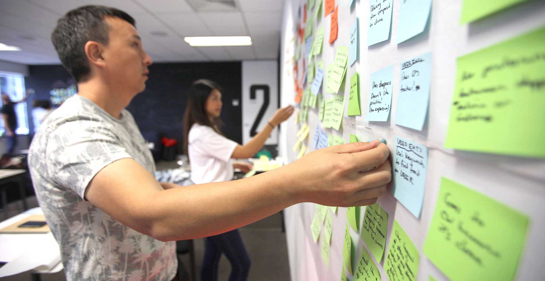
Synthesising our interviews into findings meant writing our interview notes on coloured sticky notes and then putting them up on the wall to create an affinity map. The aim of this affinity map was to group our notes into relatable categories so that we could find out what the customers biggest needs and frustrations were.

Grouping interview notes into an affinity map
In this case customers biggest source of frustration was trying to use a website that was visually unappealing and too cluttered.
Based on this our problem statement read.
“Chemist Warehouse website users needs a more visually enticing interface because the current design layout is too cluttered and deters users from active participation.”
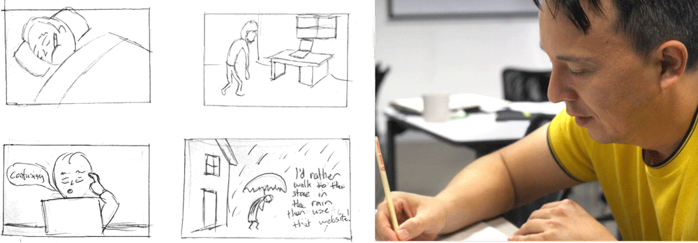
‘Problem storyboard’ depicts a sick person attempting to order Nurofen online only to give up because the user interface is too confusing.
design & solution
We set out to re-design the Chemist Warehouse website interface to be less cluttered so that it wouldn’t deter visitors from using it and would also encourage users to explore the new fast, online delivery service.
The ‘Solution’ user flow diagram of the new Chemist Warehouse website demonstrates how a customer would best navigate through the website choosing ‘Nurofen tablets’ then ordering it to their home address using this quick delivery service.
paper prototype
Through indirect competitors analysis I discovered a pizza delivery website with a user interface that was appropriate for what we required. The website had a large visually clean banner at the top of the screen that encouraged the user to type in their address details first before searching for a product.
Collectively we made very rough drawings of our new design for the website on butchers paper. The main reason for the rough mockup was to test our website user flow quickly and not have our volunteers distracted by colours or other design elements.
Directing our volunteers to test the paper prototype involved creating a task to complete on the website. In this scenario our customer lived in North Melbourne and was trying to order ‘Nurofen’ tablets online. Each volunteer was encouraged to think out loud while navigating the paper website, this was helpful to our team because it allowed us to make improvements quickly before testing another iteration.
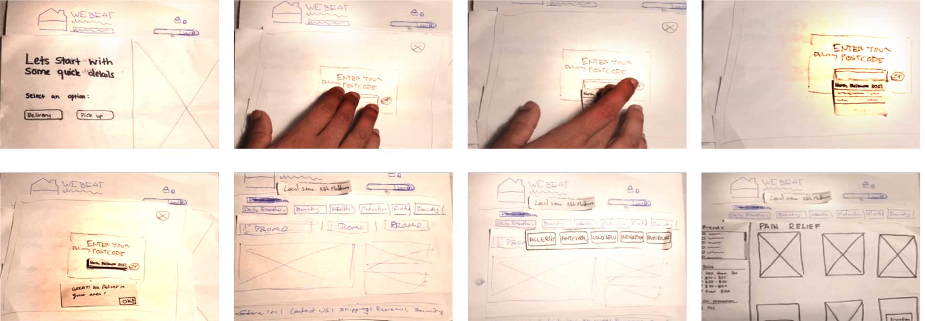
This ‘paper prototype’ demonstrates how a user navigates from providing address details to choosing Nurofen pain relief.
Some of the comments we heard from volunteers were;
“I felt that I needed to get confirmation after selecting my postcode”
“I was confused by the order summary page, is it a pop-up or a page?”
digital prototype
Taking into consideration user comments we began making improvements in a digital prototype version of the website using the software Sketch and Invision to build it.
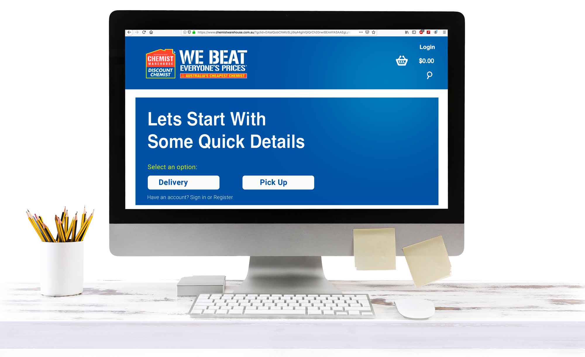
I retained the busy interface at the bottom of the screen under the new delivery service banner. The busy bargain basement look is a big part of the Chemist Warehouse branding so it was important to keep it present on the homepage. More importantly though customers were now being drawn to the delivery service taking up the majority of the screen. The Chemist Warehouse website was now a hybrid between a food delivery service and a cataloguing website.
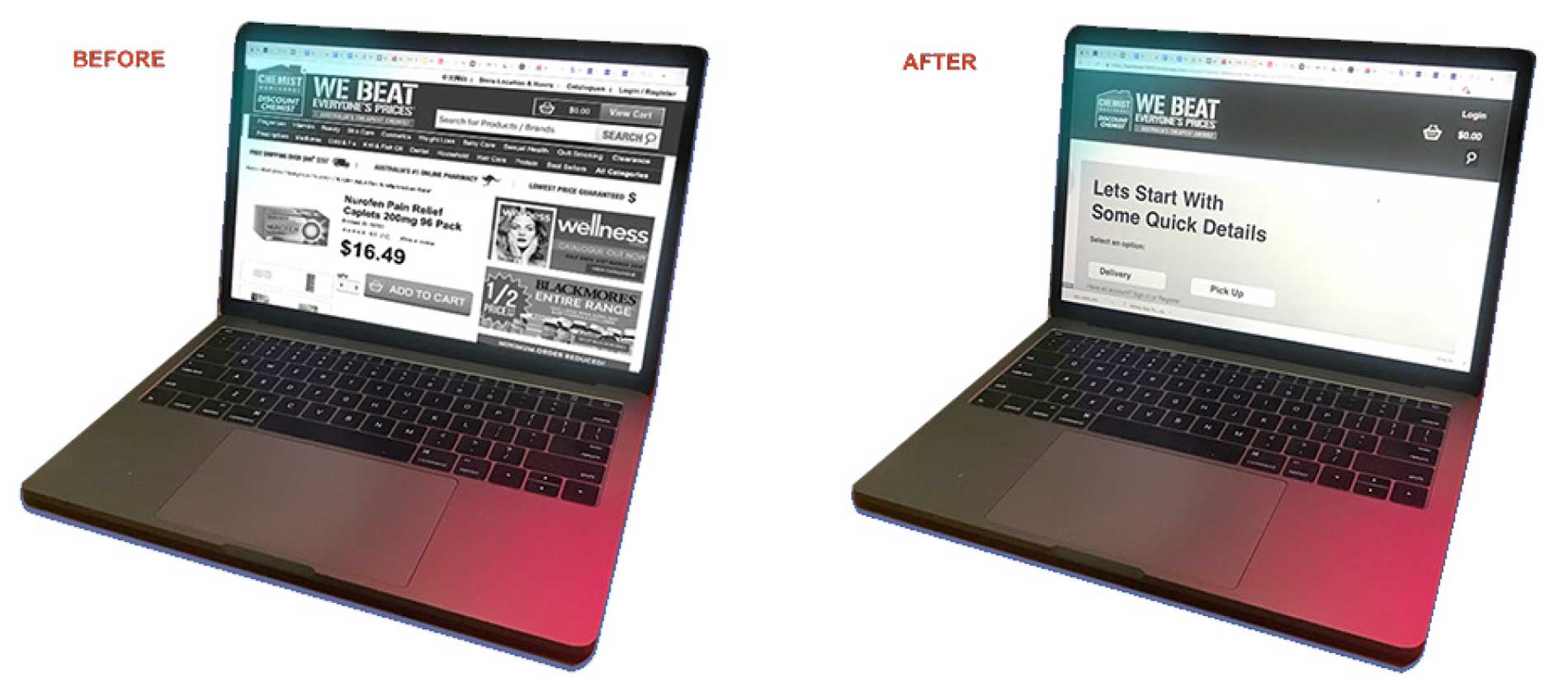
Before: This busy chemist warehouse interface After: The new clean interface with the fast, online service
Seven volunteers performed the same task with relative ease. The address details were cut off at the bottom of the screen which wasn’t ideal for the user but also hard to control while testing since many desktop screens vary in both height and width. Some users avoided the new delivery section and still wanted to browse the old menu at the bottom of the screen.
Once inside the secure payment section volunteers had to click unnecessarily to move forward and there was also no option to change the delivery address. The GPS tracking also started immediately on the order details page which shouldn’t actually happen until the driver picked up the goods.
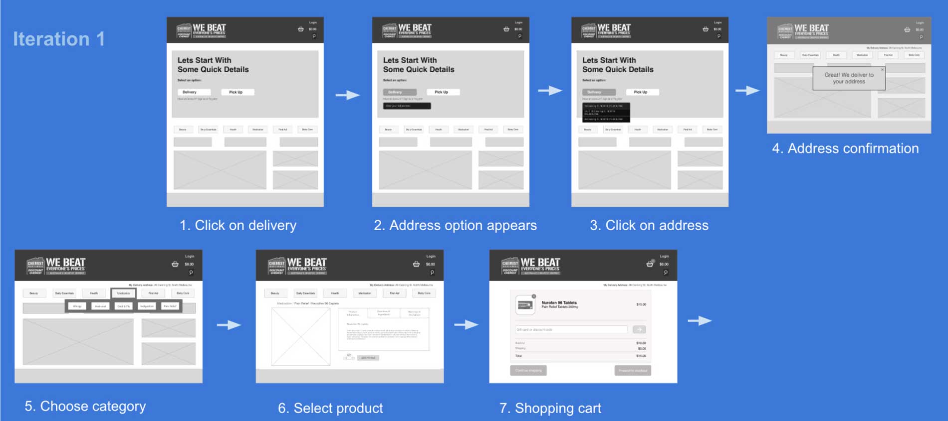
Digital prototype demonstrates how a user adds address details into the site before ordering Nurofen to be delivered.
digital prototype – iteration two
Based on these observations and feedback I created a second online clickable prototype. And in iteration 2 the secure checkout pages were condensed from iteration 1 making the payment process faster.
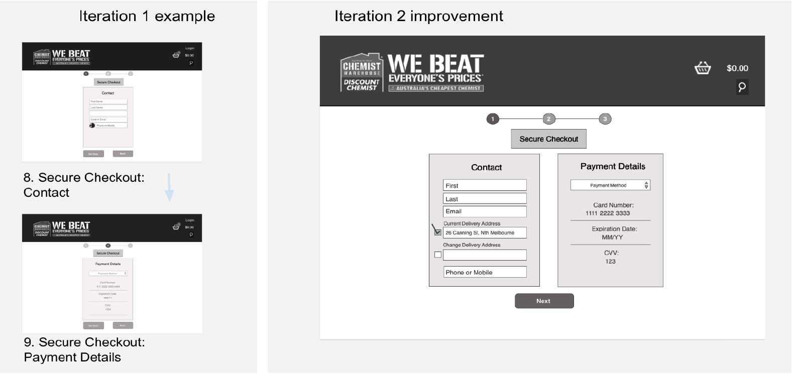
Iteration 1: Two checkout screens. Iteration 2: Both screens condensed into one speeding up the process.
The ‘Order details’ page in iteration 2 had a ‘delivery breakdown’ added, indicating to customers when the order was being prepared, on its way and had finally arrived.
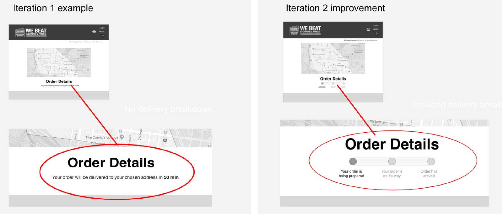
Delivery breakdown added in ‘iteration 2’ under ‘Order Details’ to keep customers updated about their order.
learnings
It was helpful interviewing customers as a group in the research phase, this way we all had a shared experience which made discussions easier when it came to grouping our affinity map. The research findings informed us that we needed a more visually appealing website and with our digital prototypes we addressed this problem (see below).
We noticed that volunteers liked to browse the website first before ordering so in future versions of the website we could create a different user flow that allows visitors to browse first before entering their delivery address. After this feature was implemented and the delivery service was well established the menu bar could then be moved back up to the top of the screen to encourage visitors to start browsing again. Since this is only a class assignment and the feature doesn’t exist it’s probably best for time being to stock up on cold and flu medication for when you are really sick.
